Over time, measures of performance of any kind show ‘ups and downs’; these ‘ups and downs’ are variations in performance.
By plotting measures over time we can learn whether the variation in performance is stable and thus predictable. In other words, if nothing changes we can predict that the future variation in performance will remain within the range revealed by the plot.
A stable system
A plot of numbers from a stable process or system could look like this: Figure 1 – An ‘In control’ process
In the capability chart above, all the data points fall in a random fashion around the average, or ‘mean’ as it is usually called. Secondly, all the data points are within (between) the upper and the lower control limits. These limits are calculated from the variation in the data.
These are the characteristics of a process said to be ‘in control’ or ‘stable’.
As long as the factors which impact this system remain unchanged, its performance capability will remain predictably between the upper and lower limits on the plot, i.e. unchanged.
With this information the manager knows, with confidence, that the only way to improve performance (permanently) and actually add any value to the work is to understand the causes of variation and then act on them. Using measures in this way fundamentally changes our conception of the managerial role.
See: understand the causes of variation
An unstable system
It may be that some of the data points do not fall randomly around the mean, or that some of them fall outside the control limits. When either of these things happens, the process is said to be ‘not in control’ or ‘not stable’ and, therefore, not predictable.
Figure 2 illustrates a plot where data points fall outside both the upper and lower control limits. This process is not stable/in control. Something special i.e. new/unusual/out of the ordinary has happened, or is going on, and may need to be investigated.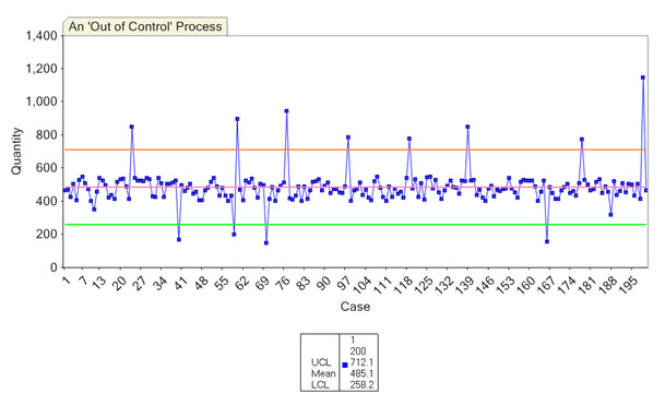 Figure 2 – An ‘Out of control’ process
A process which is not in control is unpredictable; this is the last thing a manager wants. It is hopeless for planning and predicting performance.
The data points that fall outside of the upper and lower control limits are called ‘special causes’ or ‘assignable causes’. They often relate to an event that has caused a temporary shift in performance. Visualising performance in this way encourages managers to ask: what happened here?
In service organisations it is often revealed that the extraordinary performance was not, in fact, a ‘special’ event. In other words the jobs, like processing a benefit or repairing a property were no different to those whose performance fell between the control limits. It is a worrying sign: the service is actually out of control.
Either way, the capability chart focuses managers on the need for learning from variation.
Understanding and improving performance cannot therefore relate to the ‘ups and downs’ of the individual numbers – these are symptoms of the variation inherent within the process as things currently operate.
Understanding and improving performance must be understood in terms of a movement in the parameters of the plot. This would appear as a reduction in the variation and/or the plot of performance over time showing an overall improvement, moving up or moving down.
Next step: How to construct a capability chart